Global Hunger Research Project
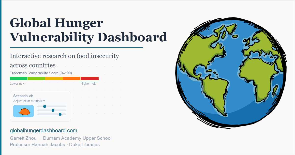
Understanding Global Hunger: A Comprehensive Research Initiative
Why this dashboard exists
Hunger is rarely caused by one thing. This dashboard brings together economic, health, climate, and crisis indicators so you can explore how they relate to food insecurity across the world. It’s built for quick exploration and for deeper, country-by-country investigation.
Read the static overview page for a crawlable summary of the dashboard, vulnerability score methodology, and links to key sections.
Core research question:
What factors drive hunger and hunger outbreaks, and how will these factors change in the future?
Where to start
- Interactive Map: Explore global patterns and click countries for details.
- Overview: See global distributions, relationships, and top-risk countries.
- Country Details: Review the score breakdown and the latest indicators for a selected country.
- Time Series: Explore how key indicators change over time.
- Data Explorer: Browse the integrated dataset and download views.
- Statistical Analysis: Adaptation buffer research — correlation matrix, OLS models, rankings, and Monte Carlo results.
Hunger Vulnerability Score (0–100)
The Hunger Vulnerability Score is a 0–100 composite that summarizes multiple risk dimensions (food security, poverty, economic capacity, health, climate vulnerability, and crisis exposure). For a full component-by-component breakdown, see Country Details .
Data Sources
All dataset citations and short descriptions are listed on the Data Sources page.
Research Context
Hunger and food insecurity remain among the most significant challenges facing humanity. Despite global progress in reducing poverty and improving food production, millions of people worldwide still experience chronic hunger, and acute food crises continue to emerge in various regions.
This research project aims to contribute to the global effort to understand and address hunger by:
- Providing a comprehensive, data-driven assessment of hunger vulnerability
- Identifying countries and regions at highest risk
- Highlighting the multi-faceted nature of hunger (economic, health, climate, conflict)
- Enabling evidence-based policy decisions and resource allocation
A quick note on missing data
Note: Some indicators may be missing or lagged for certain countries. Interpret scores as relative risk signals and use local context when making decisions.
Author: Garrett Zhou
Project: Global Hunger Research - 2025
Last Updated: September 2026
Risk summary
Distribution of countries across vulnerability tiers (left) and the five most vulnerable countries with scores above 50 (right). Interactive map filters do not apply on this tab.
Countries by vulnerability tier
Not affected by vulnerability or statistic filters on the map.
Top 5 most vulnerable countries
Highest scores among countries above 50; not affected by map filters.
Cross-country relationships
Each point is a country. Choose the outcome (Y), predictor (X), and axis scale; the scatter, least-squares line, and equation update automatically. Interactive map filters do not apply.
Indicator scatter plot
Score distribution (full dataset)
Histogram uses all countries in the integrated dataset (not only filtered rows) for a stable global reference.
Vulnerability score — global histogram
Data Explorer
Explore all integrated datasets
Complete Dataset
Scroll horizontally to view all columns. Use filters to search and sort. Download as CSV or Excel.
Distribution overview
Additional indicators
Summary Statistics Table
Global Hunger Vulnerability Map
Explore food security risk by country
This interactive global hunger vulnerability map shows how countries compare on a composite food-security risk score from 0 to 100. Each country is colored by its hunger vulnerability rating, which combines undernourishment, poverty, income, health, climate exposure, conflict, and other structural indicators drawn from FAO, World Bank, and humanitarian data sources.
Hover over a country to see its name, vulnerability score, population, and total land area. Click a country to open its detailed hunger profile. Use the score multipliers below the map to test how sensitive rankings are to each pillar, or apply map filters to focus on specific years, score ranges, and economic or health statistics.
The map is designed for quick global comparison and for identifying countries that may warrant deeper review in the Country Details section, where you can inspect score drivers, trends over time, and the full indicator set behind each vulnerability rating.
How the vulnerability score is calculated (same rules as country profiles)
Read this while you explore the map. The score has
twelve parts
. Each part adds points toward a total from 0 to 100. The final score is the sum of all parts,
capped at 100
(Formula:
min(100, sum of all pillars)
).
Part multipliers
(below the map) change how much each part counts on
this map only
: multiplier 1 = published weights, 0 = that part turned off, 2 = double that part’s points.
-
Undernourishment (maximum 25 points):
Multiply the percentage of people who are undernourished by 0.25, then cap at 25. If undernourishment data are missing, use the poverty percentage the same way.
Formula:min(PoU% × 0.25, 25); if PoU missing, min(poverty% × 0.25, 25) -
Poverty (maximum 8 points):
Multiply the poverty percentage by 0.16, then cap at 8. Poverty uses the World Bank $1.90-per-day line or, when needed, the Our World in Data $3-per-day line.
Formula:min(poverty% × 0.16, 8) (WB $1.90 or OWID $3 line) -
Income per person (maximum 7 points):
Points depend on gross domestic product per person in United States dollars: below $1,000 → 7 points; below $3,000 → 5 points; below $10,000 → 3 points; below $20,000 → 1 point.
Formula:GDP per-capita USD buckets — under 1k→7, under 3k→5, under 10k→3, under 20k→1 -
Life expectancy (maximum 5 points):
If life expectancy is under 50 years, add 5 points; under 60 years, add 4 points; under 70 years, add 2 points.
Formula:under 50y→5, under 60→4, under 70→2 -
Child stunting (maximum 5 points):
Multiply the child stunting percentage by 0.05, then cap at 5.
Formula:min(stunting% × 0.05, 5) -
Climate vulnerability (maximum 10 points):
If the climate vulnerability index is at least 60, add 3 points; at least 70, add 7 points; at least 80, add 10 points.
Formula:vulnerability index 60/70/80 thresholds → 3 / 7 / 10 pts -
Conflict intensity (maximum 10 points):
If there is active conflict: very high intensity adds 10 points, high adds 7, medium adds 4, low adds 2.
Formula:if active — Very High→10, High→7, Medium→4, Low→2 -
Major hunger crises and food security phase (maximum 15 points):
Add 15 points if the country had a major hunger crisis in the 21st century or is in food security phase 4 or higher. Add 8 points if it is in food security phase 3.
Formula:major 21st-c. hunger crisis OR IPC phase 4+→15; phase 3→8 -
Food import dependency (maximum 5 points):
Points increase when average food import share reaches 50%, 30%, or 20% thresholds.
Formula:avg food import share tiers (50% / 30% / 20%) -
Food supply (maximum 5 points):
Points increase when daily food supply per person falls below 2,400, below 2,200, or below 2,000 calories.
Formula:kcal/cap/day under 2000 / 2200 / 2400 -
Water stress (maximum 5 points):
Points increase when renewable water per person falls below 1,700, below 1,000, or below 500 cubic meters per year.
Formula:renewable m³/cap under 500 / 1000 / 1700 -
Forced displacement (maximum 5 points):
Points are based on refugees and internally displaced people, using either their share of the population or absolute numbers.
Formula:refugees/IDPs as share of population or absolute size tiers
Global Hunger Vulnerability Map (0-100 Scale)
Score part multipliers
Map score shown
= sum of (multiplier × points for each part), capped at 100
(Formula:
min(100, Σ (multiplier × pillar points))
).
Multiplier 1
on every slider matches the
published
score.
0
turns a part off on this map;
2
doubles that part. Country profile pages always use the published score.
Map Filters
Limit which countries appear on the map. Countries missing a selected statistic may be hidden when that filter is enabled.
Map Legend
Vulnerability Score (0-100):
🟢 0-25: Low Vulnerability (Green)
🟡 25-50: Moderate Vulnerability (Yellow)
🟠 50-75: High Vulnerability (Orange)
🔴 75-100: Critical Vulnerability (Red)
Note: Map colors use the multipliers under the map; hover shows the vulnerability score and each formula pillar. Countries excluded by filters remain as outlines only (no fill or hover).
Instructions
How to use this map:
1. Use the formula box at the top for coefficients; adjust multipliers under the map to explore.
2. Hover over countries for stats and the map score.
3. Click a country for the full country profile.
4. Use the sidebar to pick countries; open Map Filters below the multipliers for year, score, and statistic filters.
5. Green → red = lower → higher displayed vulnerability.
About this lab
This is not real data. Scenario Lab uses an imaginary country and inputs you choose. It is a what-if calculator that applies the dashboard’s vulnerability formula — not survey estimates, national statistics, or published country rankings.
Your scenario — country landscape
Imaginary country — inputs
Set raw statistics as if this were a single country. Pillars use the same rules and coefficients as the dashboard. Multipliers (right) scale each pillar’s points: ×1 = published index, ×0 = off, ×2 = double.
Conflict points apply only when this is checked.
Pillar multipliers & result
Displayed score
=
min(100, Σ multiplier × pillar)
. Default ×1 matches the published formula (same coefficients as the Map tab reference box).
Country Hunger Profile
Deep-dive food security indicators by country
The country hunger profile page lets you search any country and review its full vulnerability picture in one place. After selecting a country, you can explore how its hunger vulnerability score is built from twelve pillars, including undernourishment, poverty, GDP per capita, life expectancy, stunting, climate vulnerability, conflict, hunger crises, trade dependency, food supply, water stress, and displacement.
Each profile includes a score breakdown chart, key insights, vulnerability trends over time, the main factors driving the total score, a current-year summary, and a historical data table. This makes it easier to move from a global map view to country-specific analysis and to compare structural drivers of food insecurity across regions.
Use the search box below to choose a country. Profiles use the published default vulnerability formula so scores remain consistent with the map and overview pages unless you adjust multipliers on the Interactive Map tab for scenario exploration.
Select Country
Click Clear to delete the search and type a new country name.
Vulnerability score breakdown
Key insights
Vulnerability over time
Based on indicators available by year. Not every score component has a full time series.
Main score drivers
Share of each factor in the total score. Zero-weight factors are omitted.
Current year summary
Historical time series
Bangladesh Climate Change & Food Security Research
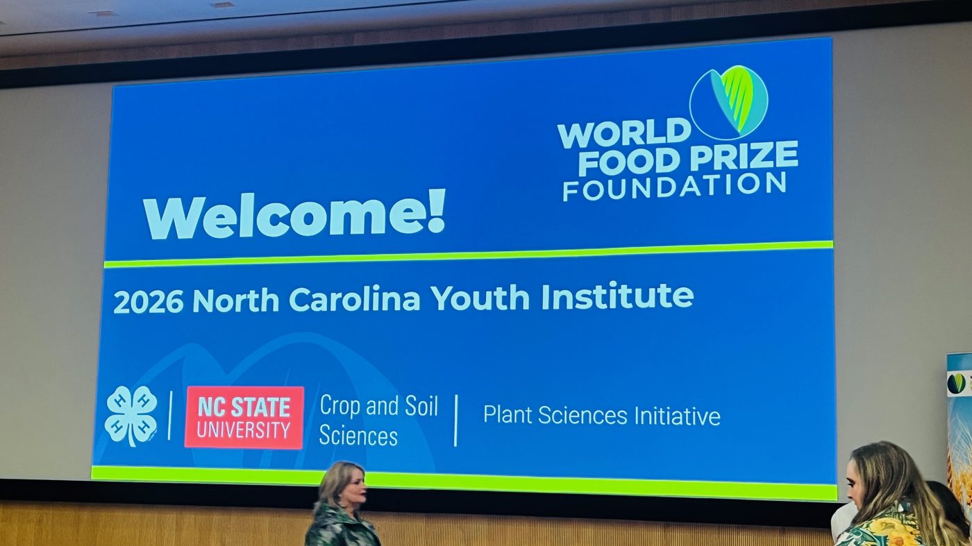
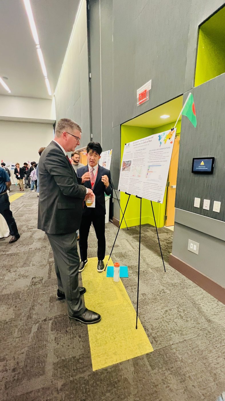
North Carolina Youth Institute and World Food Prize paper
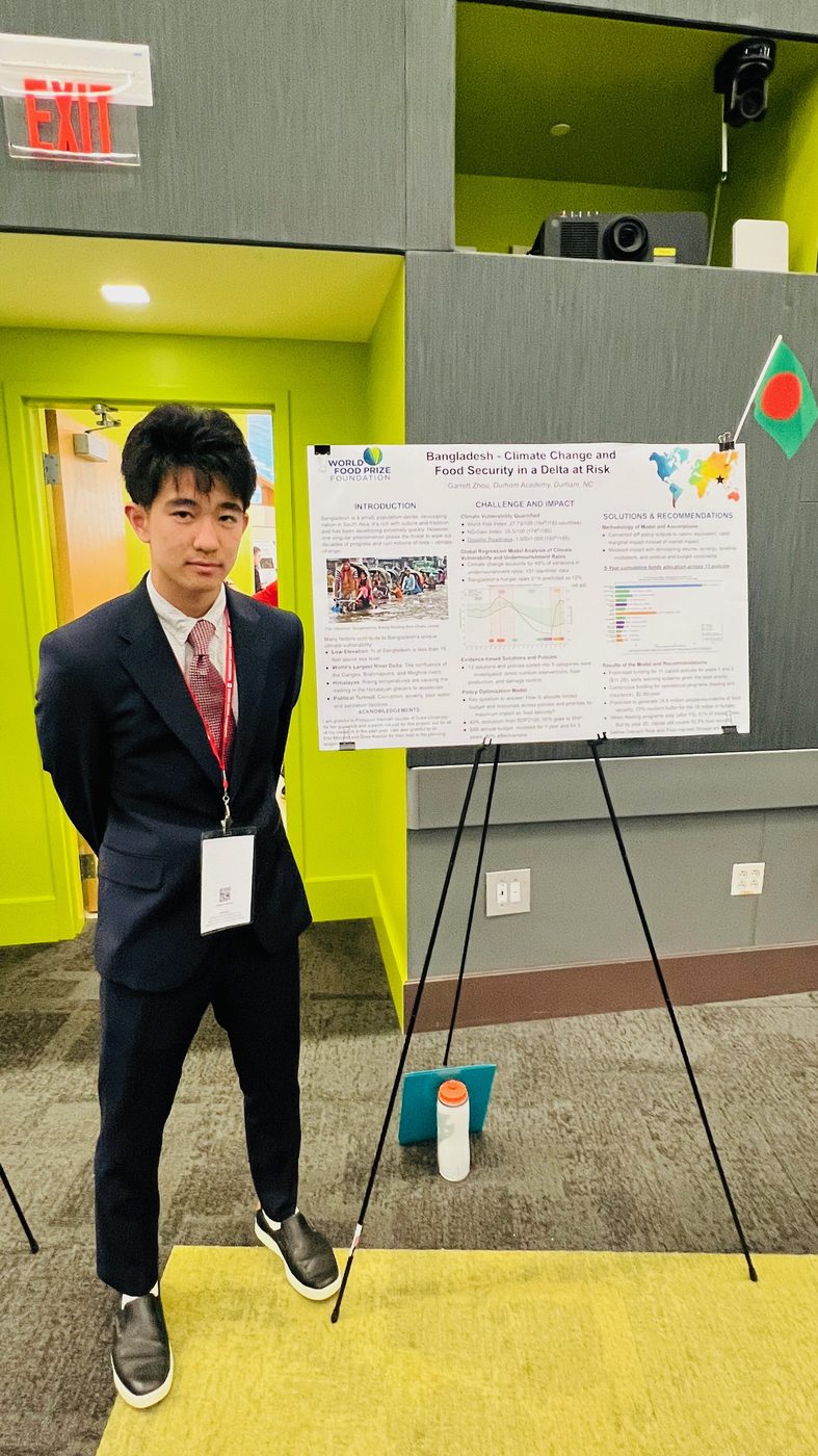
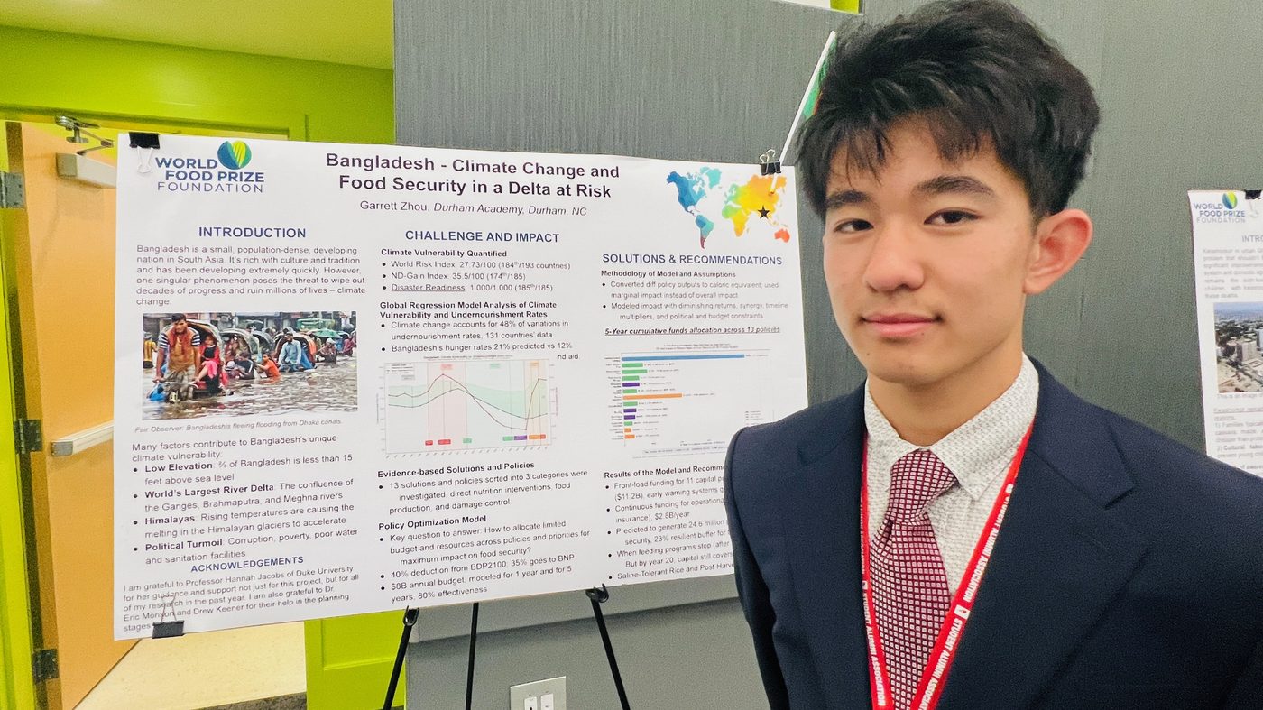
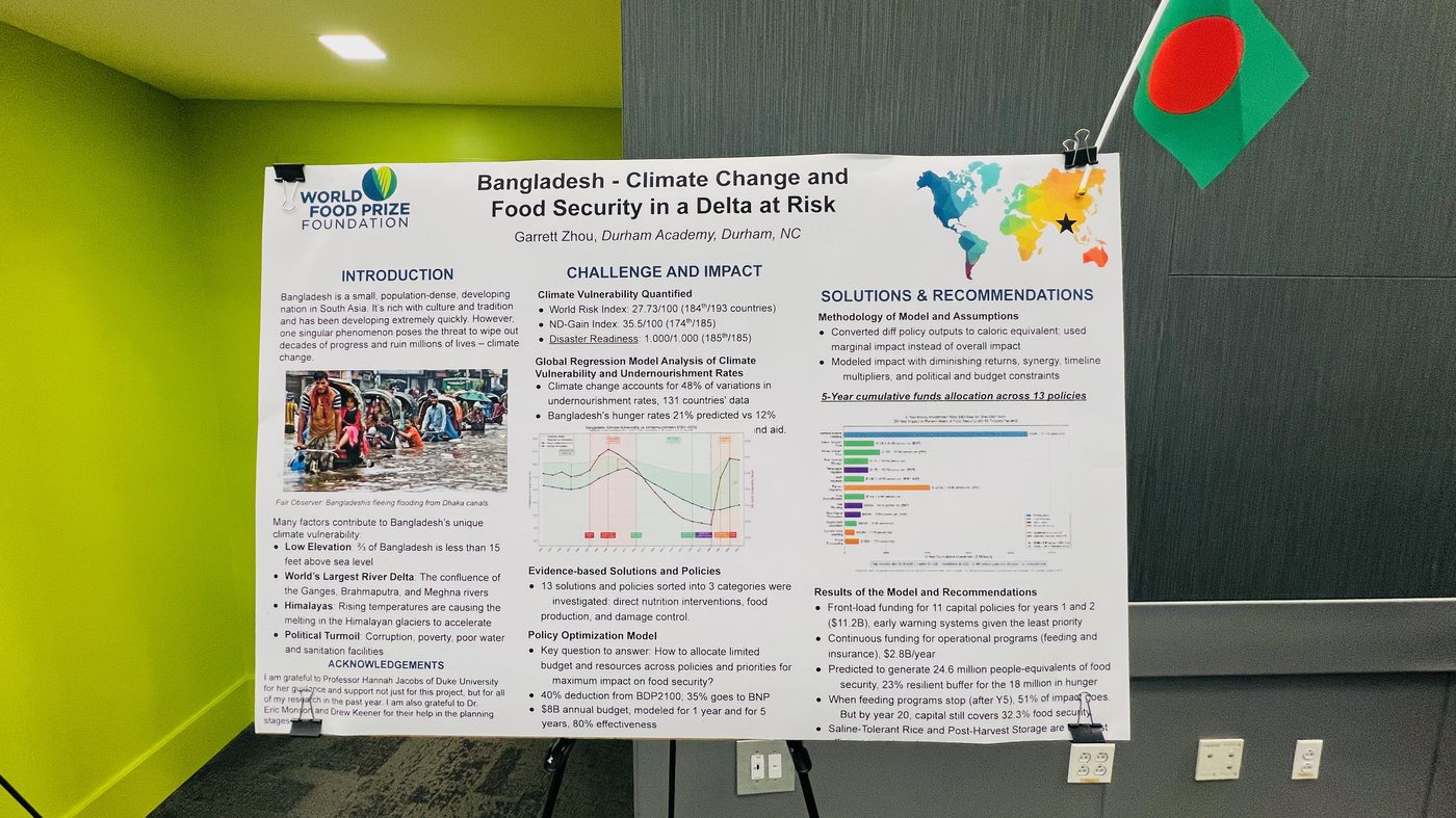
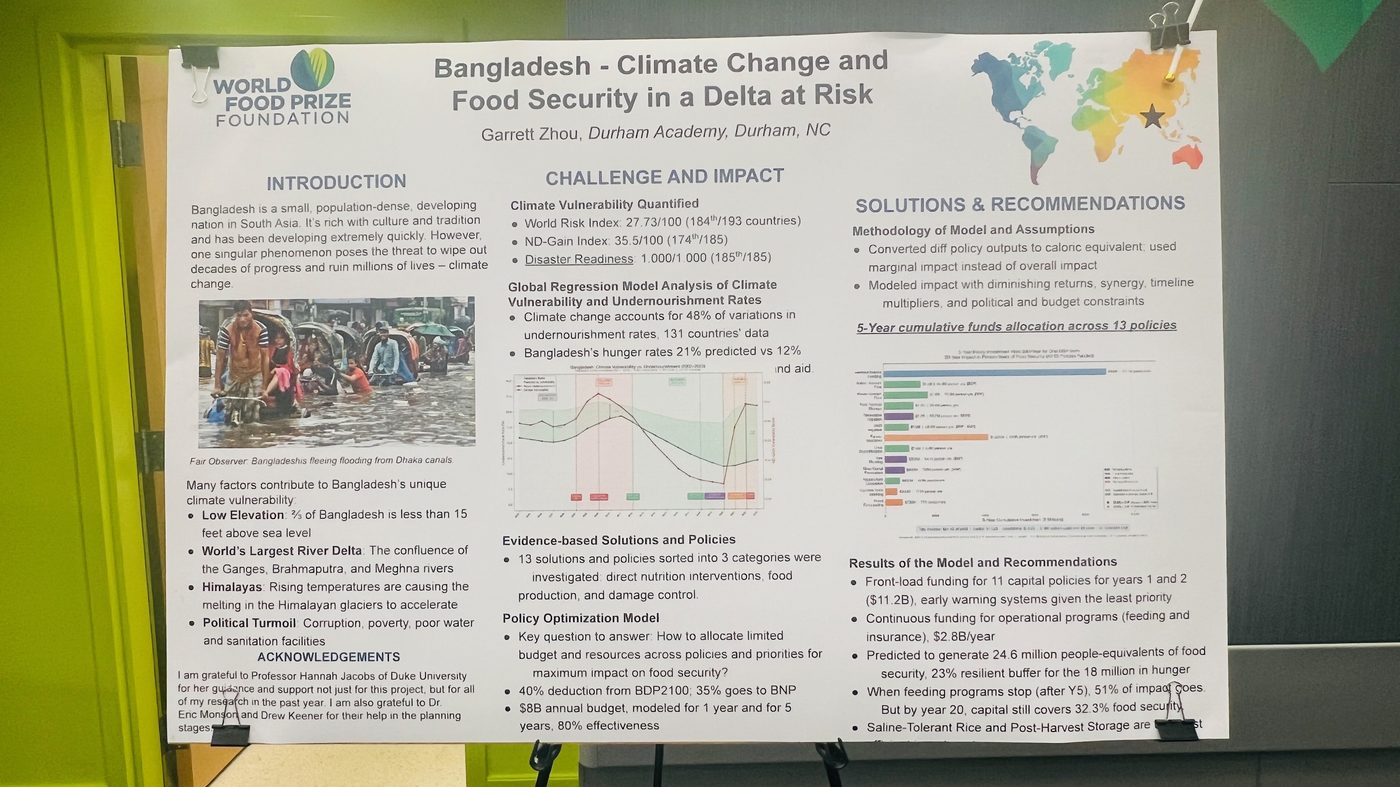
This page shares my research on how climate stressors — floods, cyclones, sea-level rise, and salinity intrusion — interact with food security in Bangladesh. I developed the work for the North Carolina Youth Institute / World Food Prize program, combining narrative evidence from the Ganges–Brahmaputra–Meghna delta with cross-country regression, Bangladesh time-series analysis, and a policy optimization model for nutrition and climate-resilient agriculture.
The research asks how climate vulnerability relates to undernourishment globally, what that implies for Bangladesh specifically, and which interventions — school feeding, saline-tolerant rice, storage, irrigation, and early warning — offer the strongest returns under realistic budget and political constraints. Open Country Details and select Bangladesh to compare dashboard indicators with the paper findings.
Bangladesh, Climate Change & Food Security
I prepared this page to share my North Carolina Youth Institute / World Food Prize research on how climate stressors interact with food security in Bangladesh — a densely populated delta where I focused on floods, cyclones, and sea-level rise.
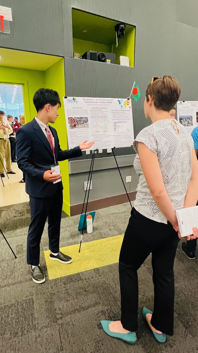
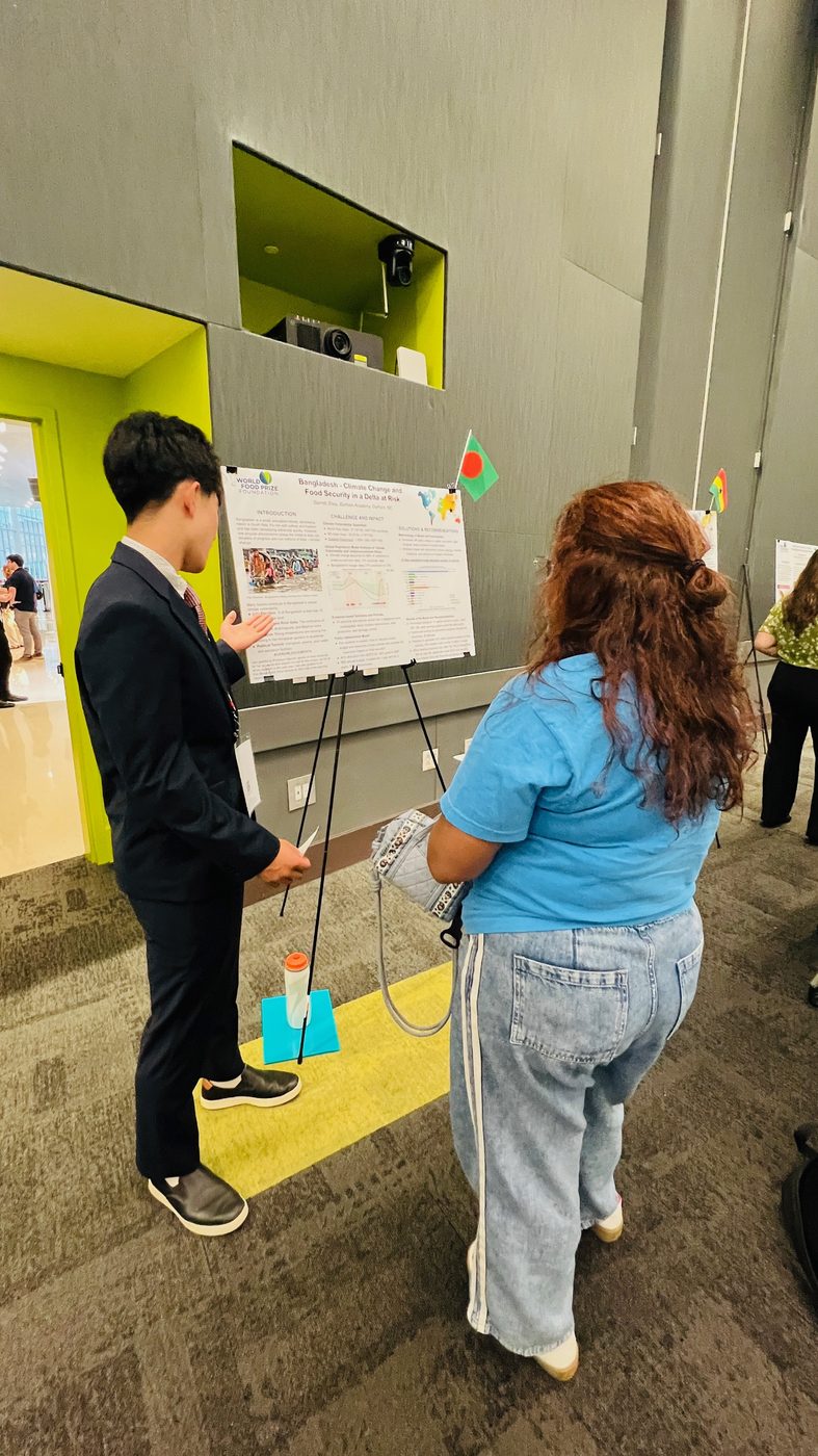
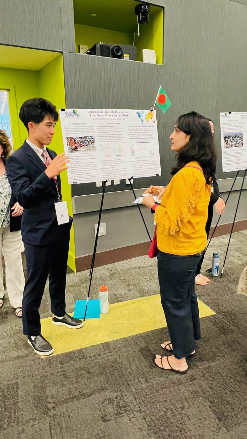
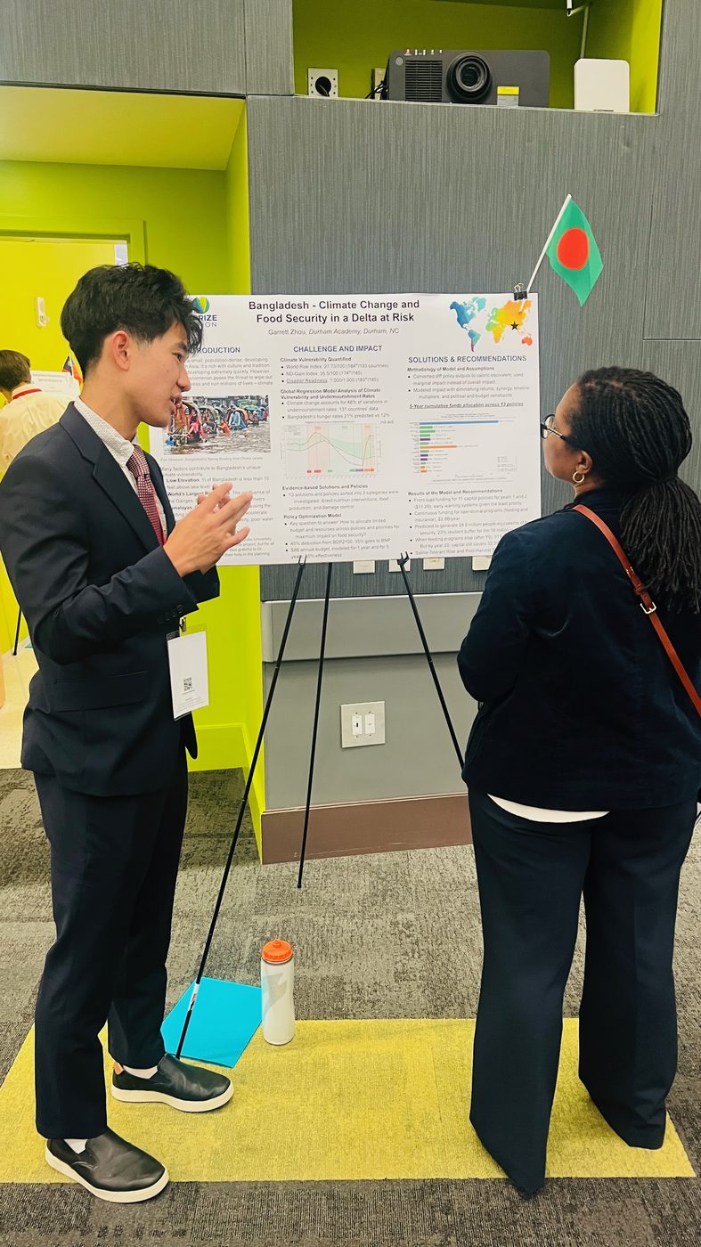
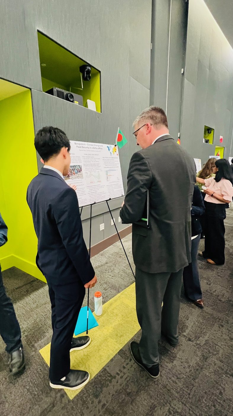
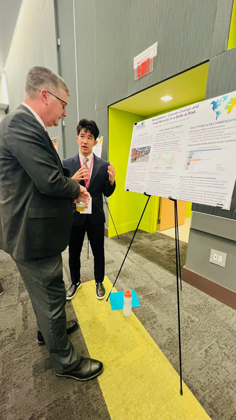
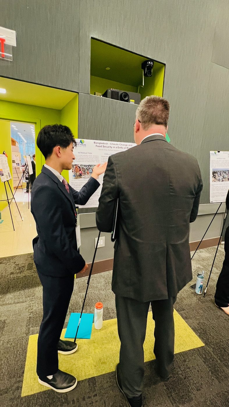
NC Youth Institute — Conference photos
Photos from my North Carolina Youth Institute / World Food Prize conference presentation. Click any image to open it full size.


Goal
- Explain how climate change undermines food security in Bangladesh, using both narrative evidence and quantitative analysis.
- Estimate how climate vulnerability relates to undernourishment across countries, then interpret what that implies for Bangladesh.
- Evaluate policy options — especially nutrition programs and climate-resilient agriculture — and outline a data-informed recommendation for investment priorities.
Background
Bangladesh sits on the Ganges–Brahmaputra–Meghna delta: extreme monsoon rainfall, river flooding, cyclones, and salinity intrusion threaten crops, drinking water, and livelihoods. Despite progress (e.g. lower undernourishment than a decade ago), the country remains highly exposed; vulnerability can rise quickly after major shocks, with hunger metrics following. The paper connects this geography to a typical family narrative, national statistics, and international context (aid, delta planning, and political transitions).
Methodology
- Cross-country regression: Relates climate vulnerability (e.g. ND-GAIN-style index) to national undernourishment rates to quantify the association (paper reports roughly 48% of variation explained in the sample used).
- Bangladesh time series: Pairs historical climate vulnerability with FAO undernourishment for Bangladesh (2002–2022) to describe periods of stability, shock (e.g. post-Sidr/Aila), and recovery.
- Policy optimization (Model 2): A constrained nonlinear allocation model over ~13 interventions (school feeding, saline- and flood-tolerant rice, AWD irrigation, storage, insurance, early warning, etc.) with diminishing returns, synergy terms, budget caps, and rules such as a BNP funding floor — calibrated to Bangladesh’s approximate caloric deficit and undernourished population.
Results (high level)
- Regression: A fitted relationship implies that at Bangladesh’s vulnerability level, undernourishment would be higher without strong adaptation and aid; actual undernourishment has remained below that “prediction,” illustrating an adaptation buffer that can shrink after shocks.
- Time series: Vulnerability spiked again in the early 2020s after a long recovery — a warning that headline hunger rates can lag vulnerability.
- Optimization: Under documented assumptions (~18M undernourished, ~700 kcal/day gap, ~4.6 trillion kcal annual deficit, $8B budget, 10-year horizon, synergies), the model allocates heavily to direct nutrition (fortified feeding), saline-tolerant rice, storage, and irrigation-style interventions while respecting policy constraints; BNP-scenario budgets show similar patterns with modest reallocation.
Full narrative, citations, and tables are in the project paper and supporting files (e.g.
Garrett Zhou WFP Bangladesh Paper D3.txt
,
model2 wfp.md
,
model2_results.txt
).
In this dashboard
Open Country Details and select Bangladesh to see live indicators (undernourishment, GRFC/IPC, disasters, climate vulnerability, poverty, and more) that complement the paper.
About the Global Hunger Index (GHI)
What is the Global Hunger Index?
The Global Hunger Index (GHI) is a peer-reviewed annual report that comprehensively measures and tracks hunger at the global, regional, and national levels. The GHI is calculated annually by Welthungerhilfe (WHH) and Concern Worldwide , with data support from the International Food Policy Research Institute (IFPRI).
The GHI was first published in 2006 and has since become one of the most widely recognized tools for measuring hunger worldwide. It provides a standardized way to compare hunger levels across countries and track progress over time.
Purpose and Background
The GHI was created to:
- Raise awareness and understanding of the problem of hunger
- Provide a way to compare hunger levels across countries and regions
- Track progress in reducing hunger over time
- Encourage increased attention to and action against hunger
- Provide policymakers with data to inform decision-making
How GHI Works
The GHI score is calculated using a formula that combines four equally weighted indicators:
- Undernourishment (33.3%): The proportion of the population that is undernourished (lacking sufficient caloric intake). This is the primary indicator of hunger.
- Child Wasting (16.7%): The proportion of children under five years old who are wasted (low weight for their height), indicating acute malnutrition.
- Child Stunting (33.3%): The proportion of children under five years old who are stunted (low height for their age), indicating chronic malnutrition.
- Child Mortality (16.7%): The mortality rate of children under five years old, which often reflects the fatal combination of inadequate nutrition and unhealthy environments.
The GHI score ranges from 0 to 100, where:
- 0-9.9: Low hunger
- 10-19.9: Moderate hunger
- 20-34.9: Serious hunger
- 35-49.9: Alarming hunger
- 50+: Extremely alarming hunger
Official GHI Website: https://www.globalhungerindex.org/
Our Vulnerability Score vs. GHI: A Detailed Comparison
Methodology Comparison
🌍 Our Vulnerability Score
Components (12 factors; max points sum to 100):
- Undernourishment: 25 points (25% of total score)
- Poverty and income per person: 15 points (15%)
- Life expectancy: 5 points (5%)
- Child stunting: 5 points (5%)
- Climate vulnerability: 10 points (10%)
- Conflict intensity: 10 points (10%)
- Historical hunger crises and food security phase: 15 points (15%)
- Food import dependency: 5 points (5%)
- Natural resources (food supply and water stress): 10 points (10%)
Scale: 0-100
Focus: Comprehensive multi-factor assessment including economic, social, environmental, and crisis indicators
📊 Global Hunger Index (GHI)
Components (4 factors):
- Undernourishment (33.3%)
- Child wasting (16.7%)
- Child stunting (33.3%)
- Child mortality (16.7%)
Scale: 0-100
Focus: Core nutrition and child health indicators
Advantages and Disadvantages
✅ Advantages of Our Vulnerability Score
- Comprehensive: Incorporates 12 factors; max points sum to 100, with percentages shown for clarity
- Predictive: Includes economic indicators (GDP, poverty) that can predict future vulnerability
- Context-aware: Considers conflict and disasters that directly impact food security
- Forward-looking: Can identify countries at risk before acute hunger crises occur
- Multi-dimensional: Captures economic, social, environmental, and crisis dimensions of hunger
⚠️ Limitations of Our Vulnerability Score
- Complexity: More factors can make interpretation less straightforward
- Data dependency: Requires data from multiple sources, some of which may be incomplete
- Weighting: Subjective decisions about point allocations for different factors
- Less established: Not as widely recognized or validated as GHI
- Update frequency: Depends on multiple data sources with different update schedules
✅ Advantages of GHI
- Established: Widely recognized and trusted by policymakers and researchers
- Focused: Clear focus on core nutrition indicators
- Standardized: Consistent methodology since 2006, allowing for reliable trend analysis
- Child-focused: Emphasizes child nutrition, which is critical for long-term development
- Peer-reviewed: Annual publication with rigorous methodology review
⚠️ Limitations of GHI
- Limited scope: Only four indicators, may miss important contextual factors
- Reactive: Primarily measures current hunger rather than predicting future risk
- Economic blind spot: Does not directly incorporate economic indicators like GDP or poverty
- Crisis factors: Does not account for conflict, disasters, or trade disruptions
- Data lag: Annual publication means data may be 1-2 years old
💡 Key Insight
Both measures serve important but complementary purposes. The GHI provides a focused, standardized measure of current hunger levels, while our vulnerability score offers a more comprehensive assessment that includes predictive factors and contextual risks. Using both together provides the most complete picture of a country's food security situation.
Score Comparison: Our Vulnerability Score vs. GHI
Score Distribution Comparison
Score Correlation Analysis
Time Series Analysis
Track trends and forecast future values
Interactive Time Series
Select a variable to view global (World) trends from the World Bank World aggregate (ISO code WLD)—not a sum or unweighted average of countries. Enable forecasting to see projected values.
Toolbar Guide:
- 📷 Camera: Download graph as JPG
- 🔍 Zoom: Click and drag to zoom, double-click to reset
- 📊 Pan: Click and drag to pan around
- 📐 Select: Select data points
- ↔️ Auto-scale: Reset axes to fit data
- 📋 Reset axes: Reset to default view
Variable Selection
Tip: Select different variables to compare trends across key indicators.
Forecast Options How it's calculated: Trends are fit on the most recent 15 years (minimum 5 points). Population and total GDP use log-linear (compound) growth; other variables use linear change per year. Each forecast step extends from the latest observed value using that recent trend—not from the full-history regression line—so the dashed line connects to the last data point. Illustrative only, not predictions.
Note: Projections are illustrative, not predictions.
Statistical Analysis
Adaptation buffer research — OLS and Monte Carlo results
Background & Purpose
This tab presents results from our research paper Climate Vulnerability Does Not Equal Hunger: Measuring the Global Adaptation Buffer . We introduce the adaptation buffer — the gap between climate-predicted and actual undernourishment — and analyze it across 143 countries using ND-GAIN vulnerability, FAO undernourishment, and World Bank development indicators.
Key finding: Climate vulnerability alone explains 42% of cross-country hunger variation, but the residual is large and structured. Countries like Bangladesh beat their climate odds by ~9 percentage points; conflict-affected states like Haiti fall far below prediction. The correlation matrix below explores relationships among dashboard indicators; the sections that follow report the paper's OLS models, global buffer rankings, and Monte Carlo uncertainty analysis.
Correlation Analysis
What is a Correlation Matrix?
A correlation matrix is a table showing correlation coefficients between multiple variables. Each cell shows how strongly two variables are related:
- Values range from -1 to +1: +1 means perfect positive correlation (as one increases, so does the other), -1 means perfect negative correlation (as one increases, the other decreases), and 0 means no relationship.
- Color coding: Red indicates positive correlations, blue indicates negative correlations. Darker colors mean stronger relationships.
- Why it matters: Understanding correlations helps identify which factors move together, which can inform policy and intervention strategies.
The Adaptation Buffer
Definition: Buffer = Predicted undernourishment − Actual undernourishment, where predicted values come from a cross-country OLS regression of FAO prevalence of undernourishment on ND-GAIN climate vulnerability.
Interpretation: A positive buffer means a country beats its climate odds (effective adaptation); a negative buffer means hunger exceeds what vulnerability alone predicts. Sample: N = 143 countries. Buffer SD ≈ 7.5 pp (range −38.8 to +14.6).
How much hunger variation aligns with vulnerability alone? This sparse benchmark defines the adaptation buffer.
What we discovered
- Climate vulnerability is a strong predictor of hunger — but only partly. ND-GAIN vulnerability alone explains 42.3% of cross-country variation in undernourishment (R² = 0.423, p < 0.001). A 0.1-point rise in vulnerability (0–1 scale) is associated with ~6.9 percentage points higher undernourishment.
- Most hunger variation is not explained by climate exposure. The remaining ~58% — with a residual spread of about 7.5 percentage points — is where adaptation, institutions, conflict, and policy matter. This unexplained gap is what we call the adaptation buffer.
- The benchmark is precise enough to use globally. Bootstrap resampling (Model 4) puts a 90% interval of [58.3, 81.5] on the vulnerability slope, so the headline gradient is not driven by a handful of outliers.
- Worked example — Bangladesh: Vulnerability 0.569 predicts 19.4% undernourishment; actual is 10.4%. Buffer ≈ +9.0 pp — millions of people who, on climate fundamentals alone, would be expected to be hungrier than they are.
Does the climate–hunger link survive controls for income, rurality, disasters, and conflict?
What we discovered
- The climate–hunger link is real, not just a poverty proxy. Vulnerability stays large and highly significant (β ≈ 40, p < 0.001) after controlling for GDP per capita, rural share, disaster counts, and conflict fatalities.
- About 40% of the raw climate gradient runs through development channels. The vulnerability coefficient falls from ~69 (Model 1) to ~40 (Model 2), meaning a substantial share of the bivariate association co-moves with income and shock observables.
- Income robustly predicts hunger levels. Each log-point of GDP per capita is associated with ~2.8 percentage points lower undernourishment (p = 0.006).
- Crude disaster and conflict aggregates show no linear signal here — but that does not mean shocks are irrelevant. Underperformance in the buffer rankings (Haiti, Syria, Kenya) suggests conflict destroys food security through channels this simple cross-section cannot capture cleanly.
What correlates with beating the climate-only benchmark? Vulnerability is excluded (it already enters the predicted value).
What we discovered
- Standard covariates barely explain who beats their climate odds. The model explains only ~6% of buffer variation (R² = 0.057). The buffer is not a repackaging of GDP, readiness, rurality, disasters, or conflict in this form.
- ND-GAIN readiness is the most promising correlate. Higher adaptive capacity is associated with larger buffers (β ≈ 13.4; a 0.1-point readiness increase ≈ +1.3 pp buffer), though p ≈ 0.12 at this sample size — hypothesis-generating, not definitive.
- Income does not predict the buffer after netting out vulnerability. GDP predicts hunger levels (Model 2) but not residual over/under-performance, because the buffer already removes the part of hunger that tracks climate exposure.
- Policy implication: buffers must be monitored directly. Because overperformance cannot be inferred from standard indicators, countries need annual buffer tracking — not vulnerability rankings alone.
Global Buffer Rankings
Countries ranked by adaptation buffer (percentage points). Overperformers report less hunger than climate vulnerability predicts; underperformers report more.
Countries reporting substantially less hunger than ND-GAIN vulnerability alone would predict.
Countries reporting substantially more hunger than their climate burden alone would predict.
Trend 1 — Conflict and weak governance destroy buffers
The deepest underperformers are dominated by political violence and state fragility, not by being the most climate-exposed countries on Earth.
- Haiti (−38.8 pp): institutional collapse and repeated crises; hunger far above climate prediction.
- Syria (−25.2 pp), Kenya (−22.1 pp), Madagascar (−20.7 pp), Liberia (−18.1 pp): conflict, displacement, or governance breakdown eroding food systems.
- Central African Republic (−9.7 pp) and Afghanistan (rank 129, −7.3 pp): hunger exceeds climate fundamentals where violence disrupts agriculture and aid.
- Significance: Vulnerability-weighted aid would systematically miss the countries where hunger most exceeds climate exposure — and overlook that conflict destroys buffers faster than climate alone erodes them.
Trend 2 — Overperformance clusters in two distinct groups
- Pacific & Indian Ocean small island states (Kiribati, Samoa, Vanuatu, Seychelles): very high exposure scores but low measured undernourishment — partly exposure-driven index mechanics; flagged for robustness.
- Agrarian states with sustained investment (Bangladesh +9.0, Senegal +12.1, Nepal +8.7, Cambodia +8.1, Philippines +7.9, Viet Nam +7.1): agricultural progress, social protection, and disaster preparedness beating climate odds.
- Sahelian overperformers (Senegal, Mauritania, Niger, Mali): among the world's most climate-exposed, yet hunger below prediction — suggesting adaptation can work even under extreme exposure.
- Significance: Effective adaptation is visible in outcome data, not only in plans. These countries are candidates for studying what policies actually work.
Trend 3 — Buffer and vulnerability diverge in the tails
A vulnerability ranking and a buffer ranking would direct aid to substantially different country lists.
- Niger (V = 0.636, among the most vulnerable) posts a +11.2 pp buffer — beating its climate odds.
- Botswana (V = 0.431, mid-range vulnerability) posts a −14.1 pp buffer — hunger far above its climate burden.
- Middle-income underperformers (Botswana, Gabon): negative buffers point to inequality and distributional failure, not raw climate hazard.
- Significance: Climate vulnerability does not equal hunger. The buffer makes performance — not just exposure — visible and trackable.
Policy takeaway
Aid and adaptation finance should use a two-axis screen: vulnerability level × buffer trend . Target countries with large but shrinking buffers (the Bangladesh-2007 cyclone pattern) for preventive finance — defending existing adaptive gains is often cheaper than rebuilding after collapse. Because Model 3 explains only ~6% of buffer variation, the watch-list must come from direct buffer monitoring each year, not from forecasting models alone.
Monte Carlo Analysis
Buffer uncertainty & collapse dynamics
Model 4 (uncertainty): 20,000 bootstrap resamples with measurement noise on FAO undernourishment. 66 countries are robust over-performers (P(buffer > 0) ≥ 90%); 42 are robust under-performers.
Model 5 (collapse): Simulated 20-year buffer paths under random climate/conflict shocks. A Bangladesh-like +9 pp buffer has a 41% chance of collapsing below zero within 20 years under baseline shocks, but only 4% once resilience investments soften shocks and speed recovery.
What the Monte Carlo simulations show
Model 4 — Are the rankings real, or statistical noise?
- The benchmark regression line is precisely estimated: vulnerability slope 90% CI [58.3, 81.5]; R² CI [0.34, 0.53].
- Nearly three-quarters of countries land in a clear camp: 66 robust over-performers, 42 robust under-performers, only 35 ambiguous.
- Bangladesh stays positive in 100% of 20,000 simulations (90% CI [+6.1, +12.1] pp); even the pessimistic tail leaves it a clear over-performer.
- Haiti and Kenya stay negative in 100% of simulations — the underperformer list is not a coin-flip.
- Significance: Point estimates from the rankings tables are trustworthy enough for policy prioritization; uncertainty is concentrated in countries near the benchmark line.
Model 5 — How fragile is a healthy buffer?
- A +9 pp buffer (Bangladesh-like) has a 41% chance of falling below zero at least once within 20 years under severe shocks and slow recovery.
- The same starting buffer has only a 4.4% collapse probability once resilience investments reduce shock damage (~40%) and speed recovery.
- Expected years underwater drop from 1.01 to 0.05 per 20-year window — both countries face identical climate exposure; the difference is absorptive capacity.
- Significance: Buffers are assets that can be built and lost. Defending a buffer through early warning, storage, safety nets, and flood protection has far higher marginal return than waiting for hunger statistics to spike — and this risk is invisible to vulnerability indices alone.
Selected countries — Monte Carlo buffer confidence
Buffer collapse simulation (Bangladesh-like starting buffer)
Hunger Risk Prediction Model
Model Parameters
Model Performance
Feature Importance
About the Global Hunger Research Project
Student-led hunger research at Duke University
I am Garrett Zhou, a high school researcher at Durham Academy , working with Professor Hannah Jacobs at Duke Libraries on this interactive dashboard. My interest in food security started when I volunteered at the Durham Food Bank of Central & Eastern North Carolina and saw how many people in my community were struggling with hunger.
The project maps hunger-related risk across countries, runs statistical models on adaptation buffers and undernourishment drivers, and includes my Bangladesh climate and food security research from the North Carolina Youth Institute. Explore the global hunger vulnerability map , read the Bangladesh research page , or review statistical analysis for the adaptation-buffer models.
About Us
Meet the research team
Global Hunger Research Project
A collaborative research initiative at Duke University
Student Researcher

Garrett Zhou
Class of 2027 High Schooler
Affiliation
Durham Academy
Durham, North Carolina
Background
I'm a high school student passionate about addressing global hunger and food insecurity. Through this research project, I aim to understand the complex factors driving hunger worldwide and develop data-driven solutions to help combat this critical issue.
I first got interested in food security when I started volunteering at the Durham Food Bank of Central & Eastern North Carolina. Seeing how many people in my own community were actually struggling made hunger feel real in a way I hadn't before.
I am the founder of HarvestHelp, a project focused on connecting communities with food support and reducing hunger locally.
Outside the classroom, I play for the NCFC Academy ECNL boys soccer team, affiliated with NCFC. NCFC youth teams participate in ECNL, and the NCFC pro team plays in the USL Championship. I have also played in the UPSL, USL Academy, and USL League Two.
Research Interests
- Digital and computational humanities
- Global hunger and food insecurity
- Data-driven policy solutions
- Food systems and sustainability
Contact & Links
[email protected]
HarvestHelp
Blog: A Grain Of Change
YouTube Channel
Faculty Mentor

Professor Hannah Jacobs
Professor of Duke Libraries
Affiliation
Duke Libraries
Duke University
Research Focus
Professor Jacobs specializes in Digital Humanities, bringing expertise in information science and digital methodologies to support innovative research projects. Her work bridges traditional humanities scholarship with modern digital tools and approaches.
Education & Expertise
- MS in Information Science, UNC Chapel Hill
- MA in Digital Humanities, King's College London
- BA in English and Theatre, Warren Wilson College
- Digital Humanities topics broadly
- Information science and data management
- Digital scholarship and research methodologies
Contact
Research Collaboration
About This Collaboration
I work with Professor Hannah Jacobs at Duke Libraries on this project. She helps me figure out how to turn a big question — why are people still hungry? — into something I can actually measure, analyze, and write about.
The dashboard pulls together public data on hunger, conflict, climate, and governance. I built the maps and models because I wanted to see the patterns myself, not just read about them in a report. If it helps someone else understand the issue a little better, that's a win.
Acknowledgments
We would like to express our gratitude to:
- Duke University and Duke Libraries for providing the resources and support for this research
- Professor Hannah Jacobs for her mentorship, guidance, and expertise in Digital Humanities
- Professor Sumedha Gupta Ariely for her guidance on global health research
- Eric Monson and Drew Keener for a joint call that helped with data visualization and geospatial mapping
- The North Carolina Youth Institute and World Food Prize for hosting a great research conference
- The Food Bank of Central & Eastern North Carolina (Durham) for their work addressing hunger locally
- All data providers including the World Bank, FAO, WFP, WHO, and other organizations that make their data publicly available
- The global research community working to address hunger and food insecurity
Learn more about Professor Jacobs at hannahlangstonjacobs.com .
Data Sources
Chicago style + quick descriptions
Data Sources
This page lists every imported dataset currently integrated into the dashboard. Sources are formatted in Chicago style and each entry includes a short description of what we used it for.
Sources are listed in Chicago style with a short description of how each dataset is used in this dashboard. In data/raw badges show which files are present on this computer.
Missing data: Not every country has every indicator. A blank or missing value means the published source did not provide a usable figure for that country after our merge — not that hunger or climate risk is absent. Vulnerability scores omit missing pillar inputs for that country; use the Data Coverage tab to see where gaps remain.
Data pipeline
Data refresh log: refreshed_at_utc=not_yet_run incoming_folder=none note=Run scripts/run_data_refresh_pipeline.sh from the project root to populate this file and refresh reports.
See
docs/data_pipeline_implementation_plan.md
,
data/metadata/data_dictionary.csv
, and
scripts/run_data_refresh_pipeline.sh
.
Data Coverage
Where data exist — and where they do not
This tab summarizes completeness across integrated countries (World Bank backbone, excluding aggregates). ✓ = value present; — = missing. Use it to prioritize collection and to sanity-check merges.
Missing data: Gaps are expected. Many indicators cover only a subset of countries or years. Missing does not mean a country is low-risk — only that this dashboard does not have that series for that place. Scores and charts use available pillars and skip missing ones.
Coverage by indicator — share of countries with a non-missing value (see Source column).
Indicator detail
Countries with fewest indicators
Lowest completeness among integrated countries (top 20).
Per-country matrix
Filter by country or region. Sort by % coverage to find sparse profiles quickly.